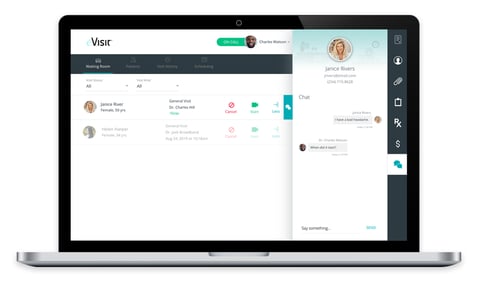
eVisit has launched its latest release of the eVisit Virtual Care platform with a waiting room chat feature aimed at enabling providers, clinicians and care coordinators to better engage with patients as they await their virtual visit, as well as an improved mobile interface that enhances the overall experience for all ⏤ patients and providers.
In response to eVisit customer demand ⏤ including requests from some of the nation’s leading hospitals and health systems ⏤ we are pleased to announce our waiting room chat feature. eVisit’s waiting room has been recognized for its industry-leading management capabilities that help queue and route patients to the right providers and triage and prep patients from the comfort of their homes.
Now it just got better!
The new waiting room chat feature delivers enhanced patient communication and helps staff maintain a stronger level of customer service in the virtual care journey. We know that schedules can go awry and that providers can fall a bit behind; we also know that long wait times with no patient communication can pose risks to virtual visit completion. This new feature is helpful for quick touch bases when providers may be a bit behind schedule, or for general pre-visit communication such as a quick assessment of a patient’s needs, or to provide direction in the event a virtual visit may not be required.

We also know that the majority of virtual visits take place with patients using a mobile device. So, we also streamlined our mobile interface to make better use of the precious real estate on the mobile screen. Mobile enhancements include consolidating feature buttons into a more flexible navigation bar at the bottom of the screen, which provides a larger viewing area on-screen ⏤ particularly important for multi-party visits. The new mobile interface also amplifies the picture-in-picture viewing so the mobile user’s image is smaller and the person with whom they are engaging is bigger. So, if you are the provider, the patient image is larger; if you are the patient, the provider image is larger.

As our co-founders always say, the eVisit app should look right at home on a smart phone between Facebook and Fortnite, and it should be engaging and easy-to-use. Our vision to “simplify healthcare delivery to everyone, everywhere” drives every design decision we make.
Learn more about the eVisit Virtual Care platform at evisit.com.


