Infographics have become an increasingly popular way to explain complicated medical trends, technology advancements and policy issues. A great infographic can change your perspective or introduce you to a new health concept you never considered before. We were very impressed with the range of visual guides we saw on health blogs and websites in 2015, and we've selected five of our favorites to share with you! These infographics are all indicative of the huge developments we saw in the health tech industry in 2015, and will serve as a sign of the times as mhealth advances throughout the next year.
1. A Brief History of Data Breaches & Security Regulations in Healthcare
Data security will always be one of the most crucial components of health technology. This infographic from Data Motion Health shows how far the healthcare industry has come in the last twenty years--and how far we still have to go.
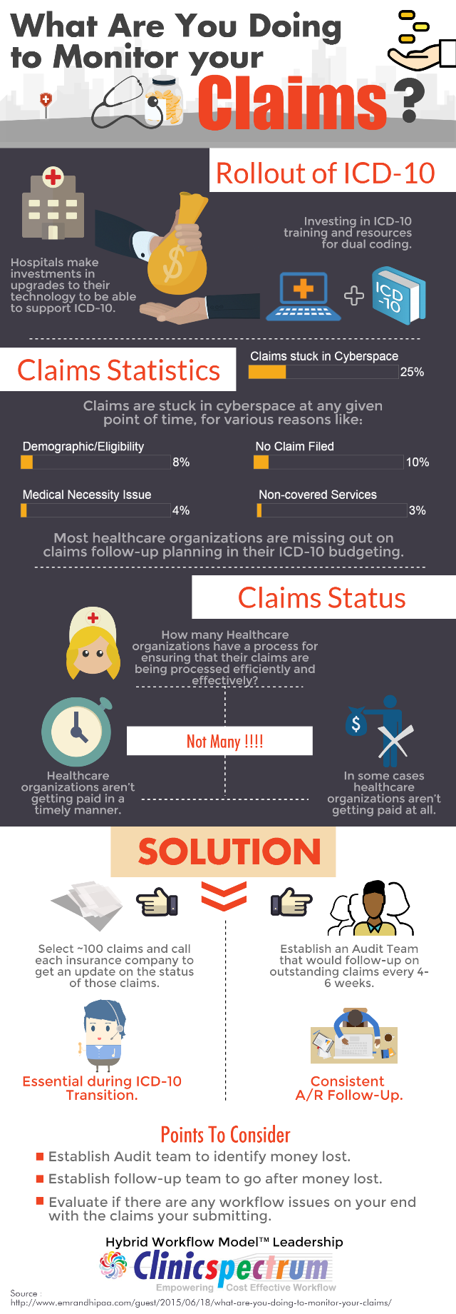
2. What Are You Doing to Monitor Your Claims?
Think way, way back to October 2015, and the massive preparation many healthcare organizations and physicians did for ICD-10. Doesn't it seem like more than a few months ago? Even though we've collectively survived the ICD-10 rollout, those preparatory tips are still relevant for your practice, such as this infographic on claims monitoring by the team at ClinicSpectrum. It's a quick visual reminder of ways to make your practice more profitable.
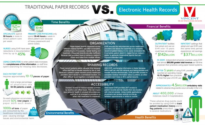
3. Traditional Paper Records vs Electronic Health Records
At this point, it may be easy for you to take your EHR or EMR for granted. But seeing the real impact using an EHR has on your patients, your practice and the medical industry as a whole helps us remember why health tech is so important. This infographic from Vincent IT shows the impact of electronic health records on physicians--and the massive number of paper cuts you avoid by using an EHR!
4. IoT and Patient Engagement: How IoT is Defining Three Es of Engagement
5. Why Healthcare is Failing Social Media
It's a harsh truth to face--healthcare professionals simply aren't making the most of social media in building up their practices. This infographic points out the enormous growth physicians are missing when they don't leverage social media as a marketing tool. But, it's never too late--you can start marketing your practice through social media right now!
We know this is a small sampling of the excellent infographics we saw this year! If you'd like to share an infographic that inspired you in 2015, we would love to see it.
Link to your favorite healthcare infographic in the comments!


