Your practice website is often a patient's first impression of you, your practice, and your brand. Your website shows how much you value your online presence and the patients whose needs you're trying to meet. In short, the website design for your medical practice is your billboard to the online world; it's an extension of your business.
[Tweet "Your website design is your billboard to the online world; it's an extension of your practice."]
Unfortunately, healthcare professionals sometimes overlook the value of a well-designed site for a medical practice. They focus on the office visit experience instead of considering how they're going to get new patients through the door. But when you don't have a well-designed practice website, you're missing out on a relatively inexpensive lead generator for building your practice. When designed well, your website can be an effective marketing and sales tool, converting perspective patients into confirmed appointments, even outside of posted office hours.
If you look around the web, you’ll see a myriad of good and bad medical practice website designs. Some practice websites are distracting, confusing, and downright frustrating while others are clear and easy to browse. So what makes a good website? Is it just pretty design and a few soothing colors?
It's much more than that. The most effective websites don’t place design over function. They use solid design fundamentals to direct the visitor's eye to the right places, while making sure information is clear and concise.
So, where do you start with your own medical practice's website?
Here's a look at 5 ways you can improve your website's design today without a complete overhaul.
Have A Clear Call to Action
If you know what you want patients to do when they arrive at your practice website, make it clear. Do you want them to subscribe to your newsletter? Do you want them to schedule a free consultation? Do you want them to request an appointment? Get clear on your messaging and how you want patients to respond. Then direct the patient's eyes to where you want them to click. In the example below, you can see how Brooklyn Urology highlights their "REQUEST AN APPOINTMENT" with an obvious green button in the left hand corner. Once you decide on your call to action, make it obvious to your visitors through the design.
Incorporate Responsive Design
It is 2015 and your practice website needs to work on mobile devices. Period. Your website should be built in such a way that it formats seamlessly to fit any viewing platform. Whether your patients come to you from their desktops, laptops, smartphones or tablets, they should be able to easily access your content. These days, 60% of website traffic now comes from mobile, so good design is one that adapts.
Offer Appointment Booking Online
Your medical practice's website is available 24/7 which means it can continue to bring in new patients long after office hours. Make it convenient for patients to book an appointment online and opt-in for your services. I love this example from Phoenix Family Medical Clinic. The medical clinic website design makes it incredibly easy to book an appointment: click the button, book the appointment. Even if a user doesn't feel comfortable booking online, they've included the phone numbers for their clinics so the barrier to contacting them is incredibly low. Side note: this is also another great example of a clear call to action. Web visitors know exactly what they should do when they arrive: book an appointment. The web design for this medical clinic uses a bright red button so you're clear on where to look.

Showcase Testimonials
Trust drives action, and people trust people (especially over brands). No matter how great you say you are, nothing is quite as compelling as hearing from your actual patients. Whether it's a written review or a simple video, let your patients sing your praises. The example below is from the a website design company called Live Your Message. Look at how they're able to pass along an information-rich message and build rapport with one solid testimonial. It may sound cliche, but a positive review speak volumes.
Kill the Distractions
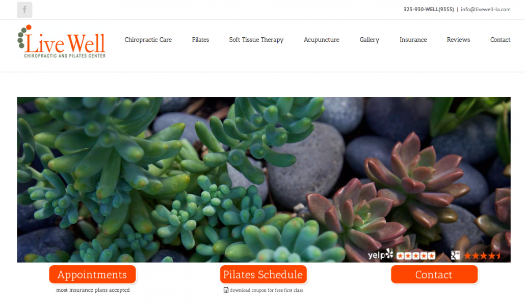
Resist the temptation to fit everything on your homepage. The human eye is easily distracted, so keep your message clear and your page organized. Utilize white space, and give your content some breathing room. Live Well Chiropractic and Pilates Center does a great job minimizing distractions and emphasizing where you'll want to click: Appointments, Schedule, Contact. Sometimes with good design, less is truly more.
Now What?
The good news is, implementing a few simple changes can do wonders for attracting more visitors to your medical practice website. Don't be shy about giving users the information they need to ensure they're making a good decision in picking your practice. Guide users through your site so they can have any easy and stress-free web experience.
What are some of your do's and don'ts for website design? Any tips and tricks you think we've missed? We'd love to hear from you in the comments below.


